0210 Aggregate Functions and Logical Functions
Aggregation Functions
Sample Table for Aggregation Functions
CREATE TABLE aggtable( Number INT, Word VARCHAR(8), intervalMonth INTERVAL MONTH );VALUES ( 2, 'two', INTERVAL '2' month ), ( 2, 'two', INTERVAL '2' month ) , ( 3, 'three', INTERVAL '3' month ), ( 4,'four', INTERVAL '6' month ) , ( NULL, NULL, NULL ); | 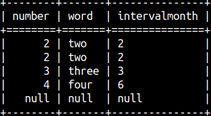 |
Sys.Functions System Table
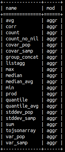
We can get a list of aggregate functions from the system table sys.functions. Aggregate functions are of the type 3.
SELECT DISTINCT name, mod FROM sys.functions WHERE type = 3 ORDER BY name; We can divide aggregate functions into three groups:
| Arithmetic functions | Concatenation functions | Statistic functions |
| avg, count, count_no_nil, max, min, prod, sum | group_concat, listagg, tojsonarray | corr, covar_pop, covar_samp, median, median_avg, quantile, quantile_avg, stdev_pop, stdev_samp, var_pop, var_samp |
Arithmetic Functions
| SQL | Result | Calculation | Comment |
SELECT AVG( Number ) FROM aggTable; | 2.75 | (2+2+3+4)/4 = 2.75 | NULL is ignored. |
SELECT COUNT( * ) FROM aggTable; | 5 | Count the rows of the table. | |
SELECT COUNT( Word ) FROM aggTable; | 4 | Count words, without NULL. | |
SELECT COUNT_NO_NIL( Word ) FROM aggTable; | Error | Doesn't work. | |
SELECT MAX( Word ) FROM aggTable; | 'two' | Last value. | Words are ordered alphabetically, A-Z. |
SELECT MIN( Number ) FROM aggTable; | 2 | First value. | Numbers are ordered numerically. |
SELECT PROD( Number ) FROM aggTable; | 48 | 2*2*3*4=48 | |
SELECT SUM( Number ) FROM aggTable; | 11 | 2+2+3+4=11 | |
SELECT SUM( intervalMonth ) FROM aggTable; | 13 | 2+2+3+6=13 | Also work with seconds. Result is of interval type. |
| We can use DISTINCT keyword to exclude duplicates. In our sample table, only number 2 is duplicate. Calculations below will be done like that duplicate value doesn't exist | 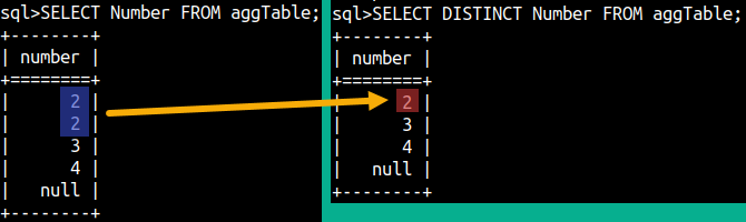 |
| SQL | Result | Calculation |
SELECT AVG( DISTINCT Number ) FROM aggTable; | 3 | ( 2 +3+4)/3 = 3 |
SELECT COUNT( DISTINCT Word ) FROM aggTable; | 3 | Count words, no NULLs, no duplicates. |
SELECT PROD( DISTINCT Number ) FROM aggTable; | 24 | 2 *3*4 = 24 |
SELECT SUM( DISTINCT Number ) FROM aggTable; | 9 | 2 +3+4 = 9 |
SELECT SUM( DISTINCT intervalMonth ) FROM aggTable; | 9 | 2 +3+6 = 11 |
Concatenation Functions
 | Concatenation is a way to aggregate text. Instead of having text occupying N rows, where on each row we have only one phrase, we can aggregate them all into one row. Result will be comma separated list of those phrases, although we can choose what delimiter will be used instead of the comma. If we want to remove duplicates, we have to use DISTINCT keyword before the name of a column. Null values will be ignored. |
| SQL | Result | Comment |
SELECT LISTAGG( Word, '|' ) FROM aggTable; | two|two|three|four | Default delimiter is a comma. Returns VARCHAR. |
SELECT LISTAGG( DISTINCT Word, '|' ) FROM aggTable; | two|three|four | With the DISTINCT we can remove duplicates. |
SELECT SYS.GROUP_CONCAT( Word, ';' ) FROM aggTable; | two;two;three;four | Default delimiter is a comma. Returns CLOB. |
SELECT JSON.ToJsonArray( Word ) FROM aggTable; | [ "two","two","three","four" ] | Result is JSON list. |
SELECT JSON.ToJsonArray( Number ) FROM aggTable; | [ "2", "2","3","4" ] | Works with numbers, too. |
SELECT LISTAGG( Word ORDER BY Number ) FROM aggTable; | two,two,three,four | We can control the order of the elements. |
SELECT SYS.GROUP_CONCAT( Word, '+' ORDER BY Number DESC ) FROM aggTable; | four+three+two+two | We can control order and the separator. |
When we use ORDER BY with the concatenation functions, then it is not possible to use DISTINCT keyword.
Statistical Functions
Numbers, from Number column, can be divided into smaller and larger numbers. Half of the numbers will be smaller and the other half will be larger numbers. The number on the border between the smaller and larger numbers is the median.
| SQL | Result | Result if we add number 5 to our column. |
SELECT SYS.MEDIAN( Number ) FROM aggTable; | 21,2(2),33,44 => 2 | 21,22,3(3),44,55 => 3 |
SELECT SYS.MEDIAN_AVG( Number ) FROM aggTable; | 21,2(2),3(3),44 => (2+3)/2 = 2.5 | 21,22,3(3),44,55 => 3 |
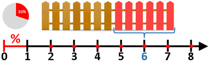
Median is a special case of a quantile. Median is a 50% quantile. But we can differently divide our numbers. We can divide them 60% vs 40%, so that 60% numbers are on the smaller side, and 40% is on the bigger side. Number between them would be called 60% quantile. In our example below, "60 % quantile" is 2.8, which means that 60% of numbers is below 2.8. This would be more obvious if we had more numbers in our column.
| SQL | Result | Calculation |
SELECT SYS.QUANTILE_AVG( Number, 0.6 ) FROM aggTable; | 2.8 | ( 4 – 1 ) * 0.6 + 1, where 4 is the count of our numbers. |
SELECT SYS.QUANTILE( Number, 0.6 ) FROM aggTable; | 3 | This is just value from above, rounded to integer. |
Variance and standard deviation are calculated differently depending whether our data represent a population or a sample.
| SQL | Result | Calculation |
SELECT SYS.VAR_SAMP( Number ) FROM aggTable; | 0.917 | |
SELECT SYS.StdDev_SAMP( Number ) FROM aggTable; | 0.957 | sqrt( variance ) = sqrt( 0.917 ) = 0.957 |
SELECT SYS.VAR_POP( Number ) FROM aggTable; | 0.687 | |
SELECT SYS.StdDev_POP( Number ) FROM aggTable; | 0.829 | sqrt( variance ) = sqrt( 0.687 ) = 0.829 |
Covariance in statistics measures the extent to which two variables vary linearly. Correlation is just covariance measured in normalized units.
| SQL | Result in MonetDB | Calculation |
SELECT SYS.COVAR_SAMP( Number, 10 - Number * 1.2 ) FROM aggTable; | -1.1 | |
SELECT SYS.COVAR_POP( Number, 10 - Number * 1.2 ) FROM aggTable; | -0.825 | |
SELECT SYS.CORR( Number, 10 - Number * 1.2 ) FROM aggTable; | -1 |

All statistic function will ignore NULLs.
Logical Operators
Binary Operators
| SQL | Result | Comment |
SELECT True AND True; | TRUE | Returns TRUE only if both arguments are TRUE. |
SELECT True OR False; | TRUE | Returns TRUE if at least one argument is TRUE. |
Unary Operators
| SQL | Result | Comment |
SELECT NOT True; | FALSE | Will transform TRUE to FALSE, and FALSE to TRUE. Always the opposite. |
SELECT Null IS NULL; | TRUE | Checks whether something is NULL. |
SELECT Null IS NOT NULL; | FALSE | Checks whether something is NOT NULL. |
All other logical operators will return Null if at least one of its arguments is Null.
| SQL | Result |
SELECT NOT Null; | NULL |
SELECT Null AND True; | NULL |
Most SQL functions will either return NULL if one of the arguments is NULL, or will ignore rows with NULL values.
Logical Functions
Operators AND, OR and NOT have alternative syntax where they work like functions. XOR can not work like operator, only like a function.
| SQL | Result | Comment |
SELECT "xor"(True, False); | TRUE | Returns TRUE only when the first argument is the opposite of the second argument (Arg1 = NOT Arg2). |
SELECT "and"(True, False); | FALSE | Returns TRUE only if both arguments are TRUE. |
SELECT "or"(False, False); | FALSE | Returns TRUE if at least one argument is TRUE. |
SELECT "not"(False); | TRUE | Will transform TRUE to FALSE, and FALSE to TRUE. Always the opposite. |