Relative Time References in Cognos Reports
This post contains a sample file for these two videos:
https://www.youtube.com/watch?v=1y1XuFCiUX0&t=493s
https://www.youtube.com/watch?v=Le8b6ui-V7k&t=27s
This post contains a sample file for these two videos:
https://www.youtube.com/watch?v=1y1XuFCiUX0&t=493s
https://www.youtube.com/watch?v=Le8b6ui-V7k&t=27s
CREATE TABLE LetterNumber( Letter CHAR, Number INTEGER ); | 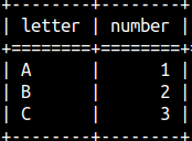 |
Views are named and saved queries. First, we make a SELECT query, we give it a name, then we save it. Whenever we need the logic encapsulated in that query, we can get it by calling the name of a saved view. The name of a view can be now used at any place where we can use a name of a table. Views are often called "virtual tables".
| Advantages of views: – Reuse logic. This also improves consistency. – Make logic modular. – Can be used to control what users can see and what can not see. – Views can be used as intermediary between database and application. This will reduce interdependence. | Limitations of views: – Changes to underlaying base tables can invalidate views. – Proliferation of views that are mutually referenced can lead to complex structures and increased interdependency. |
CREATE VIEW voc.View1 ( Letter1, Number1 ) AS SELECT Letter, Number FROM LetterNumber WITH CHECK OPTION; | This is how we create a view. voc is the name of a schema, and View1 is the name of a view. After AS keyword, we type SELECT statement. Before the keyword AS, we type column aliases. WITH CHECK OPTION is allowed subclause, but it has no affect in MonetDB. |
We can read from the view like from a table:SELECT * FROM View1; |  |
CREATE OR REPLACE VIEW voc.View1 ( Number2, Letter2 ) AS SELECT Number, Letter FROM LetterNumber; | Subclause "OR REPLACE" can be used to change already saved view. In our example, we changed the order of columns in the SELECT statement, we also changed columns aliases. |
| Now, the result of our view will be different. |  |
Each database has its own system tables where it stores database metadata. These tables are different among different database servers. In order to improve standardization, SQL committee introduced standardized set of views, called "information_schemas". These views allow us to query different databases using the same queries, and to get the same metadata. These queries below will work in MonetDB, Postgres and many other databases.
SELECT schema_name, schema_owner FROM information_schema.schemata; | SELECT table_name, table_type FROM information_schema.tables; |
We are now interested in the view "Information_schemas.views". We can get information about our view with the query:
SELECT table_name, view_definition |  |
There are many more columns in this "information_schema.views" view, but we will talk about them another time.
| It is possible to create a view based on a view. Now we have a database object that is dependent on the View1. | CREATE VIEW View2 ( Letter3 ) AS SELECT Letter2 FROM View1; |
We will try to delete View1 with this statement, but we will fail. The reason is that View2 is dependent on the View1:DROP VIEW View1; |  |
| We can solve this in two ways. We can first delete View2 and then View1. → | DROP VIEW View2; | Other solution is to use CASCADE subclause. DROP VIEW View1 CASCADE; |
CASCADE keyword will delete View1 and all of the objects that are dependent on the view View1 (that would be View2).
If we now try to delete View1, we would get an error. DROP VIEW View1; | ||
We can avoid this error with IF EXISTS subclause. With this subclause we'll always get "operation successful". DROP | ||
 | ← At the end of a book, we have an index. An index will tell us where to look for content about a term. In the index, the terms are arranged in alphabetical order, so we can easily find a word and then look up the pages where it is mentioned in the book. ↓ It's the same with databases. Indexes will help us find our rows. In the example bellow, it is much easier to search through 2 indexes, than through 5 rows of the table. This will improve our performance.  |
Indexes will speed up data reading. Indexes must be updated when data is modified, which can slow down INSERT, UPDATE, and DELETE operations. We read data much more often than we write it, so indexes are a good approach to make our database more performant.
Great thing is that we do not have to. MonetDB will create optimal indexes for us. The user is still free to create indexes manually but those indexes will only be considered as suggestions by the MonetDB. MonetDB can freely neglect user's indexes, if it finds a better approach.
CREATE INDEX Ind1 ON voc.LetterNumber ( Letter );Voc.LetterNumber is SchemaName.TableName. The index name must be unique within the schema to which the table belongs. |
| CREATE UNIQUE INDEX Ind1 ON voc.LetterNumber ( Letter, Number ); Key word UNIQUE is allowed, but it has no affect. We can set an index on several columns. A separate index entry will then be created for each unique combination of values from those columns. → |  |
| This index will fail because we already have an index with the name Ind1. |  |
 | We can have several indexes on one table or column. These is no sense in creating several indexes, of the same type, on the same column, so we should avoid doing it. |
In sys.idxs system table we can find a list of our indexes.SELECT * FROM sys.idxs; | 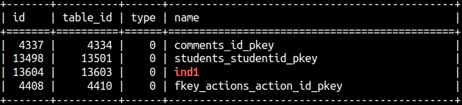 |
This is how to remove index: DROP INDEX Ind1; | All indexes are removed with this statement, including special indexes ( Imprints and Ordered index ). |
MonetDB has two special indexes: Imprints and Ordered index. These indexes are experimental and we should avoid using them.
| An ordered (or clustered) index is an index where the items in the index are sorted. This makes searching through the index, filtering item ranges, and sorting table data much faster. |  |
There are some limitations on this index:
– We can use only one column for each index.
– After UPDATE, DELETE or INSERT, on the table, this index will become inactive.
The problem is that these limitations are only according to MonetDB documentation. MonetDB will NOT enforce these limitations. Below we can see an Ordered index which is using several columns, which shouldn't be allowed. This is probably the result of the fact that this index is experimental and not fully implemented.
CREATE ORDERED INDEX Ind1 ON voc.LetterNumber( Letter, Number ); |
When we create this index, it will appear in the sys.idxs table, but we can not be sure whether it is active or not. It seems that the best bet to make this index active is to:
ALTER TABLE LetterNumber SET READ ONLY; | ALTER TABLE LetterNumber SET READ WRITE; |
Creation of this index is expensive, so we should create it ad hoc on the READ ONLY tables.
| I will delete the index we have created. | DROP INDEX Ind1; |
Imprints index is similar to Ordered index. It is experimental and not fully implemented. Some of the limitations I will talk about are not enforced by MonetDB, and they are just theoretical limitations:
This index will most likely work if we apply the same steps as for the Ordered index ( READ ONLY table, one column in index, don't change nothing else ).
NOTE: From the version 11.53.3. the Imprints index on numerical columns, explained below, is removed, and is doing nothing.
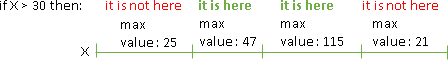
The idea of the Imprints index on numerical column is to divide that column into segments, and then to store some metadata for each segment. For example, we can store minimum and maximum value for the values in one segment. If someone applies a filter "VALUE > 30", we will be able to avoid searching through segments where the maximum value is 30 or less. This will speed up our filters.
CREATE IMPRINTS INDEX Ind1 ON LetterNumber( Number ); |
The idea of the Imprints index on a string column is to make LIKE filters faster. This index would make possible to prefilter our column by using fast but not totally accurate algorithm. After that, we can apply correct algorithm on the already reduced set of data.
| In our example, Imprints index on a string column will fail, MonetDB will enforce the READ ONLY requirement this time. | CREATE IMPRINTS INDEX Ind1 ON LetterNumber( Letter);  |
After applying "ALTER TABLE LetterNumber SET READ ONLY;", our statement will still fail, because it doesn't work on the columns that have less than 5000 rows.
CREATE IMPRINTS INDEX Ind2 ON LetterNumber( Letter ); |
INSERT INTO LetterNumber ( Letter, Number ) SELECT 'G', 500 FROM CROSS JOIN (SELECT 2 FROM sys.tables LIMIT 50 ) t2; | We can insert 5.000 rows ( 'G', 500 ) into our table by the statement on the left side. In that statement, we are using one system table as a dummy table. NOTE: For this to happen we will temporarily make our table READ WRITE. |
 | Now, that our table is READ ONLY and has more than 5.000 rows, we can apply Imprints index on the Letter column. |
We will delete these indexes: DROP INDEX Ind1; | We will delete 5.000 rows from the table:ALTER TABLE LetterNumber SET READ WRITE; |
| We insert 500 rows into the table. Due to hardware/software/power issues, our rows are only partially inserted. We do not know which rows are written and which are not. We are not sure whether rows written are correct or not. For this problem we use a transaction. A transaction is a guarantee that all rows will be inserted correctly or none of them. |
| Let's assume another example. The employee was promoted. We need to change her job title in our database and increase her salary. For this we need two SQL statements. We want both statements to succeed or both to fail. Again, we can use a transaction. | START TRANSACTION; |
So, transaction is a set of statements that will be completed fully or will have no effect at all. This is how we preserve integrity and consistency of our database.
MonetDB is using Optimistic concurrency control. That means that we do not use locks. Let's assume that we want to change the value 30 to value 60 in our database.
| First, we will take a note that current value in the table is 30. → | Parallel to that, we will prepare our number 60 for the insertion. We want to prepare all in advanced, so that we can be really fast during insertion. |
After that two things can happen:
| If the current value is still 30, then we will lock the table. This lock will be really short and will be fine grained, meaning we will only lock 1 record, in our example. It's almost as if we're not locking anything. After that, we will commit our change. Because we are really fast during commit (everything is already prepared), we reduce the chance that something bad will happen during that time. This guarantees us that the whole transaction will be completed successfully. |
| If the value in the table is changed by some other transaction, while we were preparing our insert, then we abort our mission. If this is the case, server will send an error message. After that, the user or application, can decide whether they want to retry their transaction or to do something else. Error: Transaction failed: A conditional update failed The purpose of this fail is to avoid conflicts between transactions. |
Optimistic concurrency control is great for databases where we have high read, low write workloads. That means our database should not have a lot of
conflicts where two transactions are changing the data. It is great for analytic and web databases, because of speed and scalability.
START TRANSACTION; --no need for this | By default, MonetDB uses a transaction around each individual statement. No need to manually start and end a transaction. SELECT 2; -- <= this is already an individual transaction |
| To wrap several statements into one transaction, we have to use "START TRANSACTION" and "COMMIT" statements. Now, either both transactions will succeed or both will fail. | START TRANSACTION; |
We will create one sample table.CREATE TABLE LetterNumber( Letter CHAR, Number INTEGER ); |
If we start transaction, execute some statement and don't Commit, our change will still be visible. How is this possible without Commit?
START TRANSACTION; | If we start a new session, only then we will see that our change is not really committed. The change is only visible inside of our original session, so we can check the result of our statement without really committing it. |
MonetDB documentation claims that we can make our transaction READ ONLY. This is not true, MonetDB doesn't support read only mode. It does support READ WRITE mode, but that mode is the default, so this subclause is useless.
START TRANSACTION READ ONLY; | START TRANSACTION READ WRITE; is the default, so it is unnecessary. |
| During the read of one column, someone else can change the data. If we need 5 seconds to read that column, during that time someone can: – Insert a new row. – Update a row. – Delete a row. The question is: Do we want to isolate our query from those changes? We can isolate our query completely or partially. Possible isolation levels are: 1) READ UNCOMMITTED 2) READ COMMITTED 3) REPEATABLE READ 4) SERIALIZABLE |
Default isolation level in MonetDB is READ COMMITTED (not sure 100%). For the current session isolation level can be changed with SET TRANSACTION. This statement will change isolation level, but it will also automatically start a new transaction.
SET TRANSACTION ISOLATION LEVEL READ UNCOMMITTED; | <= we change isolation level, but we also start a new transaction. <= this statement is inside the new transaction. <= we end this transaction. |
SELECT 3; | <= this is another transaction (because of autocommit). This transaction is in the same session so it is using READ UNCOMMITTED isolation level. So, this isolation level is now valid for all the transactions in the rest of the session. |
| Because SET TRANSACTION automatically starts a new transaction, we can not use START TRANSACTION immediately after SET TRANSACTION. |
| ISOLATION levels are used to save us from different anomalies ( dirty reads, lost updates … ) that can occur in a concurrent environment. A concurrent environment is an environment in which different users execute their queries at the same time. Database will always fight to eliminate these anomalies. Even if we use the READ UNCOMMITTED isolation level, anomalies will probably not occur. |
READ UNCOMMITTED will not isolate us at all. We will see everything other people are doing.
| If we start a READ UNCOMMITTED transaction (1), we will see that that in the third row we have C3 (2). In that moment, some other user will start a transaction (3), and he will change the third row to C5 (4). If we read our table again, inside our transaction, we will see that change (5). We are not isolated at all. Even uncommitted changes by other users will be visible. This anomaly is called "dirty reads". If we want to avoid this anomaly, we should use READ COMMITED isolation level. |
| READ COMMITTED will save us from dirty reads, but it won't save us from "lost updates". Transaction A starts before Transaction B. Transaction A ends after Transaction B. Both transactions try to update the value 100 to something else. Since transaction A is committed last, the value written to the table will be 115. The value 75 is lost. The solution is the REPEATABAL READ level. This level, if used by Transaction A, would lock the value 100 after reading it. This would force transaction B to fail, after step X = X – 25. We don't know in advance which transaction would be the last, so both transactions should use REPEATABLE READ. |
There is a similar anomaly as "dirty reads". That anomaly is "Non-Repeatable Reads". The difference is that the other person will not only make the change, they will also commit the change. If we can see the change before a commit, it's a "dirty reads" anomaly, if we only see it after a commit, it's a " Non-Repeatable Reads " anomaly. REPEATABLE READ will save us from this anomaly, too.
| The strictest isolation level is "SERIALIZABLE". This level will save us from "phantom reads". Phantom reads occur when one user start the transaction (1), and then he reads all the rows where gender is female (2). In the meantime, another user will start the transaction (3), he will delete one row where gender is female (4), and he will commit (5). If the first user tries to read the same rows again (inside of the same transaction), he will see the deletion made by another user (6). The same thing would happen if the rows are inserted, in that case we would see "phantom rows". |
We saw how to assign default isolation level with SET TRANSACTION. It is similar for individual transaction:
START TRANSACTION REPEATABLE READ;
SELECT 2;
COMMIT;We can control how our transaction will end. COMMIT keyword means that we want to execute our statement. ROLLBACK keyword means that we will fail our statement.
START TRANSACTION ISOLATION LEVEL READ COMMITTED; | START TRANSACTION ISOLATION LEVEL READ COMMITTED; UPDATE LetterNumber SET Number = 5 WHERE Letter = 'B';COMMIT; --will execute |
We can automatically open a new transaction after COMMIT or ROLLBACK. For that we use AND CHAIN subclause:
START TRANSACTION; SELECT 3; | START TRANSACTION; SELECT 3; --rollback this second transaction |
Savepoint is the same as the checkpoint in video games?
| If your player dies before the checkpoint: | He will have to start again from the start: |
| If your player dies after the checkpoint: | Then he can continue the game from the checkpoint: |
Idea of checkpoint is to save your progress, so you don't have to replay everything. In Transactions control, idea of Savepoint is to avoid repeating the whole transaction, if we can repeat only part of it.
We'll make an example with two savepoints, then we will see what will happen if we apply ROLLBACK, ROLLBACK to savepoint1, or ROLLBACK to savepoint2.
START TRANSACTION; --the name of a savepoint --the name of a second savepoint | Then, we can use one of these three commands:ROLLBACK; – Would rollback the whole transaction. ROLLBACK TO SAVEPOINT SP2; – Would rollback to the second savepoint. ROLLBACK TO SAVEPOINT SP1;– Would rollback to the first savepoint. |
| Starting status of our table: | Status before ROLLBACK: | If we use ROLLBACK: | If we go to SAVEPOINT SP2: | If we go to SAVEPOINT SP1: |
| After rollback to the savepoint, the transaction will still be open. It will only end after a COMMIT or ROLLBACK. |
We can delete savepoints with RELEASE command. After we release a savepoint, we can not go back to that savepoint any more.
| Before release: | RELEASE SAVEPOINT SP2; | RELEASE SAVEPOINT SP1; | RELEASE SAVEPOINT SP1; |
After releasing savepoint, the transaction is still ongoing; you can continue executing statements.
Savepoints are independent. If we release savepoint1, savepoint2 will still be alive and valid.
These commands are synonymous, we can use them interchangeably.
| SET TRANSACTION; | START TRANSACTION; | COMMIT; | ROLLBACK; |
| SET LOCAL TRANSACTION; | BEGIN TRANSACTION; | COMMIT WORK; | ROLLBACK WORK; |
MonetDB supports all of the comparison operators:
SELECT 2 < 5 AS "2<5" , 2 > 5 AS "2>5", | 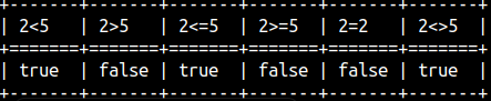 |
Comparison operators can also be used to alphabetically compare strings:
SELECT 'aa' < 'bb' AS "aa<bb" , 'aa' > 'bb' AS "aa>bb", | 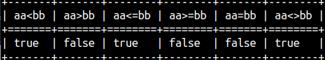 |
Beside comparison operators, we can get the same functionality with comparison functions:
SELECT "<"( 'aa', 'bb' ) AS "aa<bb" , ">"( 2, 5 ) AS "2>5", | 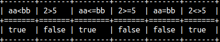 |
IS NULL operator is useful for testing NULL values. SELECT null IS NULL, 3 IS NULL; | 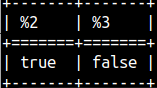 | We can also test if something is not NULL.SELECT null IS NOT NULL, 3 IS NOT NULL; | 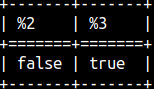 |
COALESCE function will return the first argument that is not a NULL. If all of the arguments are null, then the null will be returned. SELECT COALESCE( null, 'bb', 'aa'), COALESCE( null, null, null); | 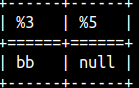 |
IFNULL function is the same as COALESCE function, but it accepts only 2 arguments. Notice that this function has to be enclosed into curly brackets. SELECT { fn IFNULL( 77, 82 ) }, { fn IFNULL( null, 82 ) }, { fn IFNULL( null, null ) }; | 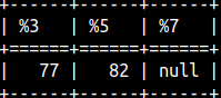 |
NULLIF function accepts two arguments. If those two arguments are the same, NULL will be returned. If they are different, the first argument will be returned. SELECT NULLIF( 77, 77 ), NULLIF( 'xx', 'yy' ); | 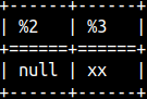 |
With ISNULL function, we can test whether some value is NULL or not. SELECT ISNULL( null ), ISNULL( 77 ); | 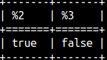 |
With BETWEEN operator, we can test whether some value belongs to some range. SELECT 2 BETWEEN 1 AND 3, 2 NOT BETWEEN 1 AND 3; |  |
BETWEEN will work with alphabetical ranges, too. SELECT 'bb' BETWEEN 'aa' AND 'cc', 'bb' NOT BETWEEN 'aa' AND 'cc'; |  |
The BETWEEN operator is inclusive. The logic behind BETWEEN is 1 >= 1 AND 1 <= 2. Therefore, the first expression below will return TRUE: SELECT 1 BETWEEN 1 AND 2, 'bb' BETWEEN 'cc' AND 'aa'; In the second expression, we should have written " aa AND cc", so we reversed our boundaries. Therefore, we will get FALSE as a result. The smaller value should go first, then the larger one. | 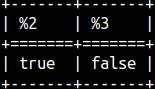 |
If we don't know in advanced which boundary is smaller and which is larger, then we should sort our boundaries before creating our range. BETWEEN operator can help us with that. We just have to enhance BETWEEN operator with the SYMMETRIC keyword. SELECT 'bb' BETWEEN SYMMETRIC 'cc' AND 'aa', 'bb' NOT BETWEEN SYMMETRIC 'cc' AND 'aa'; | 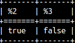 |
Between is a function, which gives us more control than the BETWEEN operator. This function has 8 arguments. On the MonetDB website, this function is poorly explained. I will explain all of its arguments except the boolean1 argument. I don't know what this argument does. "between"(arg_1 any, arg_2 any, arg_3 any, boolean1, boolean2, boolean3, boolean4, boolean5) |
In its basic form, this function will check if argument1 is between arguments 2 and 3. Boundaries are not inclusive. SELECT "between"( 1, 1, 3, false, false, false, false, false ); |  |
We can make this function inclusive if we change the last argument (boolean5) to TRUE. SELECT "between"( 1, 1, 3, false, false, false, false, true ); |  |
We can also make this function partially inclusive. Argument "boolean2" can turn on inclusivity, but only for the lower boundary. SELECT "between"( 1, 1, 3, false, true, false, false, false ); |  | ||
Argument "boolean3" will do the same, but only for upper boundary. SELECT "between"( 3, 1, 3, false, false, true, false, false ); |  | ||
If the first argument is "null", the result of the BETWEEN function will be "null". If we change the fourth argument to TRUE, then the result will be FALSE. SELECT "between"( null, 1, 3, false, false, false, false, false ), | 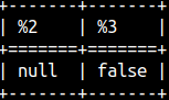 | ||
LIKE function is matching a string with a pattern. If they do match, TRUE will be returned. Wildcard % will replace 0 or many characters. "_" will replace only one character. SELECT "like"( 'abc', 'ab%', '#', false), |  |
If we need a pattern that contains % and _ characters, then we have to escape them. Third argument is used as an escape sign. SELECT "like"( 'ab%', 'ab#%', '#', false), If we want to make our pattern case insensitive, then we have to change the fourth argument to true. | 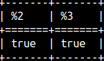 |
The opposite function of "like" function is not_like. This example would return FALSE.SELECT not_like('abc', 'ab%', '#', false); | |
IfThenElse function will give us ability to conduct ternary logic. If the first argument expression is TRUE, we will return the second argument. Otherwise, we will return the third argument. SELECT IfThenElse( 2 > 1, 'Two is larger than 1.', 'Two is smaller than 1.'); | 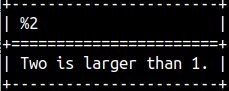 |
By placing letter e before string, we can write control characters ( Tab, New line, Carriage return ) with their specifiers. This will work even without e.
select e'A\nB' AS NewLine |
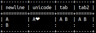 |
| Control Character | Name | Usage |
| \n | Newline | Moves the cursor to the next line. |
| \r | Carriage return | Moves the cursor to the beginning of the current line. |
| \t | Tab space | Inserts a tab space. |
| \b | Backspace | Deletes the character just before the control character. |
| \f | Form feed | Moves the cursor to the next page. |
| \u | Unicode character | Represents a Unicode character using a code number. |
Without e, the result is the same ( e'A\tB' = 'A\tB' ). If we want to write literal specifiers, then we have to use prefix R.
select r'A\nB' AS NewLine, r'A\u2764' AS Unicode, R'A\tB'AS TAB; | 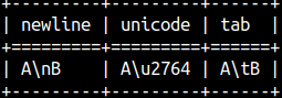 |
| We can write blob with pairs of hexadecimal characters. Before such blob we should type X or blob. | SELECT x'12AB', blob '12AB'; |
Concatenation can be done with operator || or with concat function. Concat function accepts only 2 arguments.SELECT 'p' || 'Q' || 'R', concat( 'p', 'Q' ); | 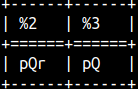 |
Length function returns number of characters. Synonims for length function are char_length and character_length. MonetDB encode all of the strings with UTF-8. Some of UTF-8 characters use several bytes. If we want to know length of a string in bytes then we should use octet_length function.SELECT length(R'2€') AS CharNo, octet_length(R'2€') AS ByteNo; | 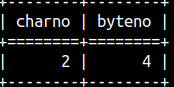 |
In our example, LOCATE looks for the substring 'es' within the second argument. If it can find it, LOCATE will return in what position. SELECT LOCATE( 'es', 'successlessness' ), LOCATE( 'es', 'successlessness', 8 ); We can give a third argument. In our example, we will not search for 'es' in the first 8 characters. Synonym for this function is CHARINDEX. | 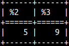 |
POSITION function will also return position of the substring 'es'.SELECT POSITION( 'es' IN 'successlessness' ); |  |
PATINDEX function is similar. Difference is that this function can use wildcards. It can use '%' for zero or more characters or '_' for one character. It will return position, not of the first letter, but of the last letter.SELECT PATINDEX( '%eS', 'succeSslessness' ),PATINDEX( '____eS', 'succeSslessness' ); | 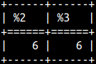 |
SELECT PATINDEX( 's%c', 'succeSslessness' ), --0; --0 | These examples show the logic behind PATINDEX. |
All of these functions (LOCATE, CHARINDEX, POSITION, PATINDEX) are case sensitive. SELECT CHARINDEX( 'ES', 'successlessness' );If they can not find substring, all of them will return zero. |  |
SUBSTRING function will return all the letters of the string after some position. SELECT SUBSTRING( '123456', 3 ), SUBSTRING( '123456', 3, 2 ) ; With the third argument, we can limit number of characters returned. | 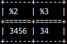 | |
If the second argument is too large, we will get an empty string.SELECT SUBSTRING( '123', 5 ), SUBSTRING( '123', 2, 7 ) ; If the third argument is too large, it will have no effect. | 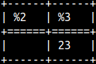 | |
Instead of SUBSTRING, we can use SUBSTR.
LCASE will transform the string to lower case. UCASE to upper case. Synonyms are LOWER and UPPER. SELECT LCASE( 'NEW' ), UCASE( 'new' ), QGRAMNORMALIZE ('Prize €50!');Special function QGRAMNORMALIZE will transform the string to upper case while removing all the strange characters, only numbers and letters will remain. | 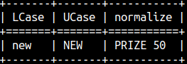 |
| We can order words alphabetically ( Apple, Zebra ). Minimum function will return the word closer to "A", and maximum function will return the word closer to "Z". SELECT sql_min( 'Apple', 'Zebra' ) AS "MIN", sql_max( 'Apple', 'Zebra' ) AS "MAX";Synonyms for these functions are LEAST and GREATEST. | 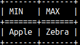 |
| ASCII function will return Unicode number of the first character of the string (ß=>223). CODE function will return the opposite, for the Unicode number, it will return the character (223=>ß). ASCIIFY function will transform all of the non-ascii characters to ascii equivalents (€=>EUR). SELECT ASCII( r'ßzebra' ) AS FirstLetterUnicode | 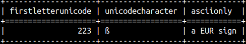 |
| We can pad some string with spaces from the left, or from the right side. Second argument decides what should be the length of the whole string. SELECT '=>' || LPAD( 'zz', 5 ) AS LeftPadding |  |
If used, third argument will be used instead of the space sign.SELECT LPAD( 'zz', 7, 'OE' ) AS LeftPadding, RPAD( 'zz', 7, 'OE' ) AS RightPadding; | 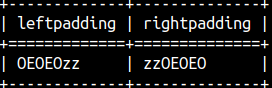 |
If the string is already too long, then it will be truncated from the right side. SELECT LPAD( '12345', 3 ) AS LeftPadding , RPAD( '12345', 3 ) AS RightPadding; | 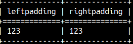 |
We can trim spaces from the start, from the end, or from the both ends of a string. SELECT 'leftTrim' || LTRIM( ' <=' ) , RTRIM( '=> ' ) || 'righTrim' , TRIM( ' A ' ) AS BothSides; | 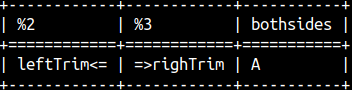 |
The second argument can be used to specify the string to trim. SELECT 'leftTrim' || LTRIM( 'UUU<=', 'UU' ) , RTRIM( '=>UUU', 'UU' ) || 'righTrim' , TRIM( 'zzAzz', 'z' ) AS BothSides; | 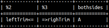 |
With SPACE function we can repeat space character many times. With REPEAT function we can repeat any string many times. SELECT '|' || SPACE(5) || '|', REPEAT( 'OE', 5); | 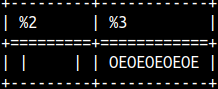 |
This is how we can get the first or last two characters. SELECT LEFT( '1234', 2 ), RIGHT( '1234', 2 ); | 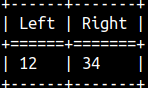 |
This is how we can check if the string starts or ends with some other string.SELECT startswith( 'ABC', 'AB' ), endswith( 'ABC', 'bC' ); | 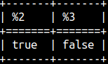 |
If we want to make comparison case insensitive, then we have to provide TRUE for the third argument.SELECT startswith( 'ABC', 'ab', true ), endswith( 'ABC', 'bC', true ); | 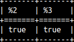 |
CONTAINS function will check whether second string is contained inside of the first string. The function is case sensitive. We can make it insensitive by adding third argument TRUE.SELECT CONTAINS( 'remarkable', 'MARK' ), CONTAINS( 'remarkable', 'MARK', true ); | 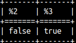 |
| REPLACE function will search for the second string inside of the first string. It will replace it with the third string. This function is case sensitive. SELECT REPLACE( 'repeat', 'peat', 'try' ), REPLACE( 'repeat', 'PEAT', 'try' ); | 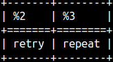 |
INSERT function will remove characters between positions 3 (2 + 1) and 6 (2 + 4). It will replace them with the last argument. In the second column, it will search between positions 3 (10 – 8 + 1) and 6 again, but this time it is counting from the end. SELECT INSERT( 'remarkable', 2, 4, 'MARK' ), INSERT( 'remarkable', -8, 4, 'MARK' ); | 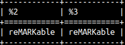 | |
If the second argument, in INSERT function, is too big, then the string will get a suffix. SELECT INSERT( 'remarkable', 50, 4, 'MARK' ); | 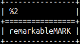 | |
SYS.MS_STUFF function is similar to INSERT function. Main difference is that for the second argument we have to provide the exact position. Instead of 2 we have to provide exact 3. SELECT sys.ms_stuff( 'remarkable', 3, 4, 'MARK' ); | 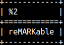 | |
If we make a mistake with the second argument, while using SYS.MS_STUFF function, we will get an empty string as a result. SELECT sys.ms_stuff( 'remarkable', -3, 1, 'MARK' ), sys.ms_stuff( 'remarkable', 50, 1, 'MARK' ); | 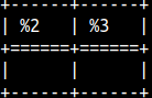 | |
| Interesting thing with the SYS.MS_STUFF function is that the third argument can be negative. This argument will then duplicate several last characters from the start of the string. SELECT sys.ms_stuff( 'remarkable', 3, 0, 'MARK' ) AS "0" --reMARKmarkable , sys.ms_stuff( 'remarkable', 3, -1, 'MARK' ) AS "-1" --reMARKemarkable , sys.ms_stuff( 'remarkable', 3, -2, 'MARK' ) AS "-2"; --reMARKremarkable | 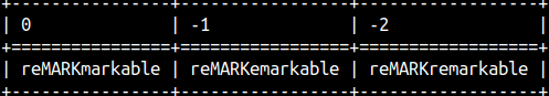 |
| FIELD function can have unlimited number of arguments. First argument is the string we are searching for. All other arguments are a list in which we are searching. The result will be the position of the first string in that list. That position is zero based. SELECT FIELD( 'A', 'A', 'B', 'C' ), FIELD( 'B', 'A', 'B', 'C' ); | 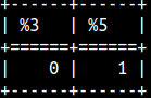 |
Search is case sensitive. If we can not find the string, the result will be NULL.SELECT FIELD( 'z', 'A', 'B', 'C' ); |  |
With sys.md5 function we will calculate a hash of a string. Hush will have 32 hexadecimal characters. SELECT sys.md5('abc'); | 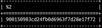 |
SPLITPART function will split the string by its delimiter. That will transform the string into list. From that list we will take the third element. SELECT SPLITPART( 'a1||b2||cd3||ef4', '||', 3); |  |
We have two functions to return the size of a BLOB in bytes. They are the same function. SELECT length(x'0012FF'), octet_length(x'0012FF'); | 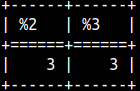 |
Before calculating similarity between two strings, we should standardize those strings as much as possible. In MonetDB, we can achieve that with QGRAMNORMALIZE function.
QGRAMNORMALIZE function will remove everything accept letters and numbers. All letters will be transformed into uppercase. SELECT QGRAMNORMALIZE('Yahoo! Japan'); | 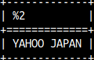 |
In order to transform word "kitten" into word "sitting" we need one insert, and two updates.
| kitten -> ("k" to "s" update) -> sitten -> ( "e" to "i" update ) -> sittin -> ( add "g" on end ) -> sitting | If the "price" of each step is 1, the full price for 3 steps is 3. We can get number of steps with Levenshtein function. That is how we measure similarity of words. Deletes would be also counted as 1. |
SELECT LEVENSHTEIN('kitten','sitting'); |  |
| The DAMERAU-LEVENSHTEIN function is similar to the LEVENSHTEIN function. The difference is that DAMERAU-LEWENSTEIN also takes transpositions into account. In the DAMERAU-LEVENSHTEIN function, "AC" -> "CA" is only one step. In the LEVENSHTEIN function, we would have to update two letters, so that transformation would be 2 steps. | It seems that in MonetDB, these two functions are the same, and the behavior is controlled by the number of the arguments. |
| If we want to achieve the behavior of the DAMERAU-LEVENSHTEIN function, we have to provide 5 arguments. Last three arguments are in order: costs for insert/delete, substitution, transposition. | SELECT LEVENSHTEIN('AC','CA', 1, 1, 1 ), DAMERAULEVENSHTEIN('AC','CA', 1, 1, 1 ); | 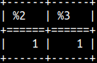 |
| If we provide only two arguments, then functions will act as a LEVENSHTEIN function. | SELECT LEVENSHTEIN('AC','CA'), DAMERAULEVENSHTEIN('AC','CA'); | 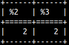 |
SELECT LEVENSHTEIN('AC','CA', 1, 1, 3 );We will make transposition to cost 3 steps. | But the result is still only 2. That is because we can achieve the same result in three ways. AC -> (transposition) -> CA --cost would be 3 steps We will always get the smallest metric. | 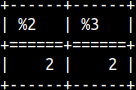 |
There is also a version of the LEVENSHTEIN function with 4 arguments. In this function, default cost for the insert is 1. Third argument is DELETE, forth is REPLACE. Transposition is not possible in this case, so it will not act as a DAMERAULEVENSHTEIN function.
SELECT LEVENSHTEIN('AC','CA', 2, 2 ) AS "22", --insert1 + delete2 = 3 LEVENSHTEIN('AC','CA', 3, 2 ) AS "32", --insert1 + delete3 = 4 LEVENSHTEIN('AC','CA', 2, 3 ) AS "23", --insert1 + delete2 = 3 LEVENSHTEIN('AC','CA', 3, 3 ) AS "33"; --insert1 + delete3 = 4 | 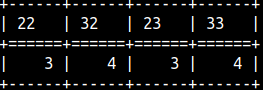 |
| EDITDISTANCE is the same as DAMERAULEVENSHTEIN. Everything cost 1 point, but transposition costs 2 points. SELECT EDITDISTANCE( 'AC', 'CA' ); | EDITDISTANCE2 is the same as DAMERAULEVENSHTEIN. Everything cost 1 point. SELECT EDITDISTANCE2( 'AC', 'CA' ); |
Jaro-Winkler function will compare two strings. If they are the same, result will be 1, if they are totally different, result will be 0. These functions will give bigger result to strings which have the same prefix. The bigger the prefix, the bigger the boost will be. SELECT JAROWINKLER('ACA','CAA') AS "ACA-CAA" | 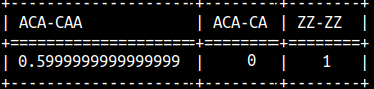 |
SOUNDEX function works only for English language. SOUNDEX function will transform a string to number. That number depicts how that word would be pronounced in the English language. If two words have the same pronunciation, then SOUNDEX function will return the same number for those 2 words. SELECT SOUNDEX('Rose') AS "Rose", SOUNDEX('Rows') AS "Rows" | 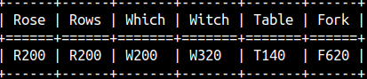 |
Soundex result is made of the starting letter of the word, and three numbers. If two words have the same SOUNDEX code, then DIFFERENCE function would return 0, because there would be 0 differences.SELECT DIFFERENCE('Rose', 'Rows') AS "R", --R200 vs R200 => 0 So, the result of the DIFFERENCE function can be between 0 and 4. | 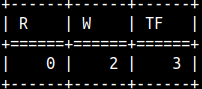 |